Marie Le Conte Powerful Voice Turning Gossip Into Truth
A positive rise through journalism, with sharp criticism of power

Introduction
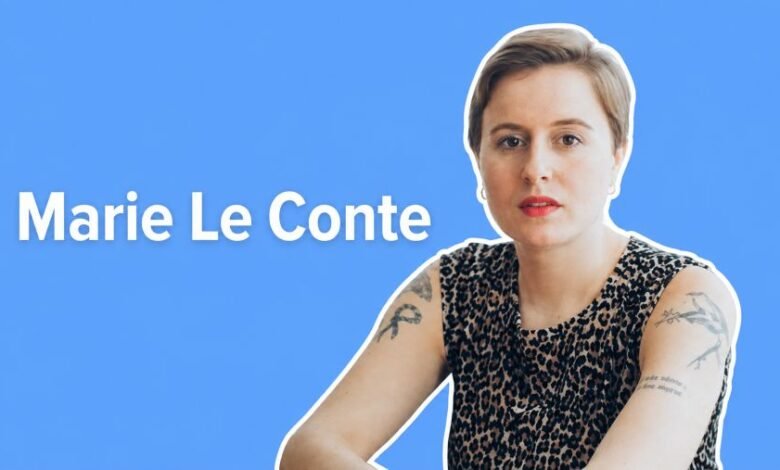
Marie Le Conte is a French-Moroccan journalist and author based in London. She is known for writing about British politics, Westminster culture, gossip, media, identity, and the internet generation. Her work stands out because she explains serious political ideas in a clear, witty, and human way. On her official website, she describes herself as a French-Moroccan freelance journalist and art dealer living in London.
As a French journalist and author, Marie Le Conte has built a strong public reputation through articles, columns, books, newsletters, radio appearances, and public speaking. Her positive strength is her ability to make politics understandable. Her negative edge is her willingness to criticise power, media habits, and online culture when they become confusing, unfair, or harmful.
Quick Bio
| Field | Details |
|---|---|
| Real Name | Marie Le Conte |
| Birth Year | 1991 |
| Age | About 34–35 in 2026 |
| Nationality / Background | French-Moroccan |
| Residence | London, United Kingdom |
| Early Life | Grew up in Nantes, France |
| Education | Journalism BA Honours, University of Westminster, 2013 |
| Profession | Journalist, author, columnist, broadcaster, newsletter writer, public speaker, art dealer |
| Known For | British politics, Westminster culture, political gossip, internet culture |
| Newsletter | Young Vulgarian |
| Major Books | Haven’t You Heard?, Honourable Misfits, Escape |
Early Life and Education
Marie Le Conte grew up in Nantes, France, before moving to the United Kingdom in 2009 to study journalism. Her French-Moroccan background gives her public writing a distinctive point of view, especially when she writes about British politics and culture as someone who can observe it with both closeness and distance.
She studied at the University of Westminster and graduated with a Journalism BA Honours degree in 2013. The university lists her as a political journalist and author, which reflects how strongly her career later developed around media, politics, and public commentary.
Start of Career
Marie Le Conte started her professional path through freelance journalism. Between 2013 and 2015, she wrote for several publications, including the Telegraph and the Mirror. This early freelance period helped her build experience across British media and gave her the foundation to become a recognised political writer.
She later joined the Evening Standard as a political diarist. That role was important because it connected her more directly with Westminster, political gossip, and the daily culture of British political life. It also helped shape the reporting style that later became one of her strongest public signatures.
Career as a French Journalist and Author
Marie Le Conte is best known for her journalism on politics and culture. She has worked with BuzzFeed News and the Evening Standard, and she has written for publications such as The Guardian, The Sunday Times, Prospect, VICE, and i-D.
Her journalism often focuses on the people, behaviour, networks, and informal conversations behind politics. Instead of only writing about official speeches and policies, she looks at gossip, reputation, private influence, media reaction, and the social atmosphere around Westminster.
Books and Writing Style
Marie Le Conte’s first major book, Haven’t You Heard?: Gossip, Politics and Power, explores how gossip and informal information influence political life. The book helped turn political gossip into a serious subject of analysis by showing how whispers, relationships, and rumours can shape public power.
She also wrote Honourable Misfits, a book about unusual and eccentric figures in British parliamentary history, and Escape, which examines how a generation shaped, damaged, and survived the internet. Her writing style is readable, sharp, funny, and thoughtful, which makes her work suitable for both general readers and political audiences.
Career Timeline
| Year / Period | Career Highlight |
|---|---|
| 1991 | Marie Le Conte was born |
| Childhood | Grew up in Nantes, France |
| 2009 | Moved to the UK to study journalism |
| 2013 | Graduated from the University of Westminster |
| 2013–2015 | Worked as a freelance journalist |
| 2015 | Joined the Evening Standard as a political diarist |
| 2016–2017 | Worked with BuzzFeed News |
| 2018 | Named in Forbes 30 Under 30 Europe, Media & Marketing |
| 2019 | Published Haven’t You Heard? |
| 2021 | Published Honourable Misfits |
| 2022 | Published Escape |
| 2026 | Continues writing, publishing, and public commentary |
Achievements and Career Stats
One of Marie Le Conte’s most notable achievements came in 2018, when Forbes included her in its 30 Under 30 Europe list for Media & Marketing. Forbes identified her as a journalist and recognised her growing influence in media.
Her career stats are not measured like sports statistics. Instead, her achievements include published books, national media bylines, newsletter writing, public speaking, radio appearances, and a continuing role in British political and cultural commentary.
Business Ventures and Public Work
Marie Le Conte’s professional work goes beyond traditional journalism. Her official website says she is also an art dealer, public speaker, radio and podcast guest, and newsletter writer. She also writes columns, essays, profiles, book reviews, and other long-form pieces.
Her newsletter, Young Vulgarian, adds another important part to her public profile. Through newsletter writing, she can speak directly to readers outside the limits of traditional newspapers and magazines, making her voice more personal, flexible, and independent.
Social Media and Public Presence
Marie Le Conte uses the public identity “Young Vulgarian” across parts of her online presence. Her official website points readers toward her newsletter and professional work, while public profiles connect her with journalism, authorship, radio, and art dealing.
Her public presence is strongest through writing rather than celebrity-style publicity. She is known for ideas, commentary, books, essays, and sharp observations about politics, society, and the internet.
Recent Work and News
Marie Le Conte remains active as a journalist, columnist, and commentator. Her official website describes ongoing work across features, profiles, essays, book reviews, newsletters, and columns. This shows that her career is still active and developing.
Her recent public work continues to connect politics with culture, identity, online life, and media behaviour. This makes her relevant not only as a political journalist, but also as a commentator on how modern people live, communicate, and understand public life.
Legacy
Marie Le Conte’s legacy is developing around her ability to explain politics through human behaviour. She has helped readers understand that politics is not only built through laws, speeches, and elections, but also through relationships, gossip, status, ambition, reputation, and informal influence.
As a French journalist and author working in London, she brings a distinctive international voice to British media. Her positive contribution is clarity, humour, and originality. Her critical side challenges power, online culture, and the hidden systems that shape public conversation.
Conclusion
Marie Le Conte has built a strong career as a French-Moroccan journalist, author, columnist, broadcaster, and public commentator. From Nantes to London, from journalism student to recognised political writer, her journey shows determination, intelligence, and originality.
Her work matters because she explains complicated political and cultural subjects in a human way. Through her books, journalism, newsletter, and public speaking, Marie Le Conte continues to shape conversations about politics, media, gossip, and the internet generation.
FAQ
Who is Marie Le Conte?
Marie Le Conte is a French-Moroccan journalist and author based in London.
What is Marie Le Conte known for?
She is known for writing about British politics, Westminster culture, political gossip, media, and internet culture.
Where did Marie Le Conte grow up?
She grew up in Nantes, France.
What did Marie Le Conte study?
She studied journalism at the University of Westminster and graduated in 2013.
Is Marie Le Conte an author?
Yes, she is the author of Haven’t You Heard?, Honourable Misfits, and Escape.
What is Marie Le Conte’s profession?
She is a journalist, author, columnist, broadcaster, newsletter writer, public speaker, and art dealer.
What is Marie Le Conte’s newsletter?
Her newsletter is called Young Vulgarian.
Why is Marie Le Conte important in journalism?
She is important because she explains politics through people, gossip, reputation, media, and culture in a clear and original way.